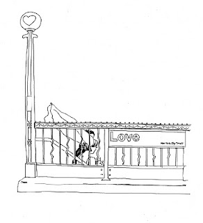
They were good clients. They picked out a color palette, (peacock blue and chartreuse) and wanted to embrace the theme of subways and New York City (Jeff loves mass transit, and Ashley thinks it has its merits), and they had a good concept of what they liked and didn't like. Originally inspired by the mosaics found in MTA subway stations, I developed this style board and sent to them for review.

Then I drafted up some rough sketches.

Although the mosaic theme didn't make it through the first round of edits, the subway idea stuck. I asked them to take reference photos so I had the right scale, angle, and sign fonts to work from.


From there, I developed this sketch for the invitation, and Ashley and Jeff liked it:

After a few rounds of edits I created these pieces, the invitation:

and the RSVP cards (front):

and back:


No comments:
Post a Comment